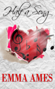
I’d appreciate your opinion as to which book cover you like the best. Pay no attention to the watermarks on some of them. These are just sample layouts. Once I decide on a cover, the designer will remove all those and scale everything as it should be.
If you don’t like any of them…tell me. If you like the background but not the couple or vice-versa…let me know. I’m really looking for honest input. A designer can play around with color, shading, fonts, etc.
Keep in mind the characters are mid-thirties.
Left to right is: Heart/pink stripe/color-splash/jukebox


Thank you so much for your help!


Hey Ann. I like the one with the juke box in the background. After all, they met in a honky tonk. I think it works best.
Thanks, Bobbie. I appreciate you taking time to vote. I’ve laid out at least a dozen covers but narrowed it to these four. With no clear-cut winner, I may have to go back to the drawing board!!
Dear Ann–
I like pink stripe. They’re all really good, but I like the sheet music background.
dags 🙂
Thanks, Dags. I like the sheet music background too! That scrap is just that…just a scrap that I added to the larger pink stripe background. If it came in a different color, like blue, I think it would look better, but no such luck. I’ll keep working on it. Your input is helpful so thanks for taking time to vote.
Hi Ann
There isn’t a clear winner for me. I was immediately drawn to Heart, however I think for your story and audience, one of the character ones would be more appropriate.
I prefer the character positioning in Color-splash and Jukebox.
The background of Jukebox, though eyecatching, is a bit “busy”. If you do go for that I’d take out the cold beer and make the floor less prominent. The black and white tiles are a bit distracting.
I love the colors of Color-splash, but would insert the music sheet from Pink Stripe.
So I think overall I would go with Color-splash with a music sheet.
I’m interested to know what others say.
Thanks, Bindi.
I first tried the jukebox image without the tile floor. The only color I could replace it with was black to make it look right. Once I did that, the whole cover was so dark it lost its appeal. So I put the tile back in and because it only had just a sliver of it on the image, I had to add more for it to look right. I’ll try adding the scrap of music to the color-splash to see how that looks. I hadn’t thought of that. I’m having a heck of a time with this cover. I’ve looked at hours of couples trying to find ‘the two’ I liked. Either the guy is right or the girl is right, but finding a couple that’s right has been a challenge.
I appreciate you taking time to help with this.
Hi Ann,
I like the #4 the jukebox, the cover elements work with the storyline.
Thank, Lynn. I appreciate your vote. I’m having a hard time deciding so I hope I’ll have a clear cut winner among voters.
Hi Ann,
They’re all quite good but I vote for #2 – the pastel colors with the half a sheet music.
Thanks, Gray! So far, it’s one of the top two choices. I’m getting close to making a decision. Thanks for taking the time to give me your opinion. I love getting a man’s point of view!! ~Ann